Archive | Data matters RSS feed for this section

Mapping crime

14 Jun

Inquirer crime mapper tool screenshot

I’ve hesitated to post this, because I’m not totally sure I endorse the frame it imposes.

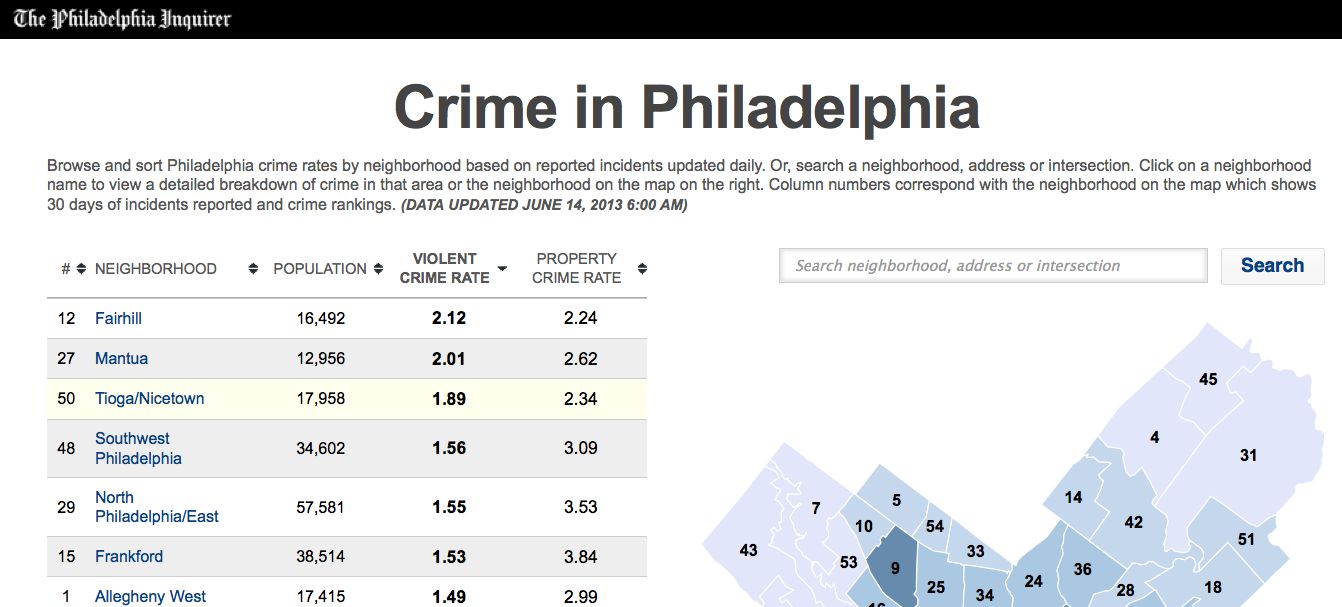
But here it is: The Philadelphia Inquirer website now has a crime mapping tool, which is slightly less useful than it sounds.

Basically, you can look at the rate of crime by neighborhood, calculated as a rate of X crimes per 1,000 residents. (They break out the property crime rate and the violent crime rate separately.)

I’m not sure how they are defining neighborhood boundaries, although I suspect it might be by police district.  Regardless, it’s a somewhat weird — some “neighborhoods” have 10,000 people and others have close to 60,000. That’s a big range.

You can search by address, sort of. If you type in an address it will take you to the crime data for that neighborhood, with a list of specific incidents by block number (e.g., “Robbery — 3900 block of Chestnut St.”)

An important caveat: The tool includes only data from the last 30 days. So seasonal variation or passing trends could really mess with the numbers.

I haven’t quite figured out how this tool connects to a better Philadelphia. Would like to hear your thoughts in comments.

Note: I suspect this will go behind a paywall soon, but will leave this post up regardless.

Advertisement

A market opportunity for journalism

11 Jun

Dave Davies at WHYY makes an interesting point regarding Philadelphia’s recent horrible building collapse:English bulldog

I want those responsible for this atrocity held accountable too, but I wonder if a year from now, all the furor over slipshod demolition and shady contractors will have changed anything.

  • In 1996 a massive fire of discarded tires shut down a section of I-95, and for a weeks politicians and TV crews were all over the issue of tire disposal.
  • In 2000, a nightclub on a pier in the Delaware River collapsed and killed three people. City inspectors were immediately dispatched to examine every pier on the river.
  • And last year, the tragic Kensington fire that killed two firefighters led to a new focus on large, abandoned properties.

Davies says some kind things about the city’s most recent efforts to improve oversight, and continues:

The question is whether the city’s Department of Licenses and Inspections can really do all this stuff in addition to the other burdens they carry, many of them heavier because of past disasters….

I’ve seen a lot of people in city government over the past 25 years. Plenty of them occupy the corner office while things in their departments go on as they always have.

Then once in a while, but you see somebody who has the vision, guts and managerial skill to make change. It’s not easy in the public sector, but it does happen.

It means getting better technology and putting it to good use. It means understanding the arcane civil service system and making it work. It means listening to union leaders and joining them in common purpose. It means holding supervisors accountable for getting the job done. I’ve seen it happen, and it can be inspiring.

You know what else can be inspiring? When a journalist takes hold of a story like a bulldog and hangs on for years, wringing every drop from it.

C’mon, WHYY, I’m looking at you. Make a topic page and stay on this. Check back in six months, in seven months, in eight months. Track the incremental progress/lack of progress, not just the big anniversaries or the inevitable court case. Be journalists.

Photo credit: Wikipedia.

People get killed

25 Apr

The 2013 State of the City report is out. It’s overflowing with charts and factoids, so I’ll probably be doing several posts on it. Many are interesting, some are surprisingly illustrative, and a few are fairly problematic.

The one I’m starting with is one of the latter.

The graphic in question is on page 24 of the pdf version of the report. I can’t embed it, so here’s what it looks like:

Philadelphia Homicide Victims: Who They Are and How They Died

88% male

82% gunshot

81% prior arrests

80% African American

74% killed outside

62% age 18-34

Do you get the feeling that one of these things is not like the others? Yes, me too.

In a city of 1.5 million residents, 300,000 of whom are ex-offenders (no, that’s not a typo), flagging homicide victims as having a “prior arrest” isn’t particularly useful as a descriptor.

It is, however, a fairly transparent way to signal don’t worry folks, you’re not really at risk.

I don’t know how many people got mailed a copy of Pew’s report, but I’d be willing to bet that their demographics are pretty different from those of the homicide victims cited above.

So why does this matter? Well, Pew is the multi-billion-dollar gorilla in our city. The data they choose to highlight, and the way they choose to illustrate it, have strong ripple effects.

Suggesting — even obliquely — that one of the six most relevant facts about people who were killed in our city is their arrest record is a pretty remarkable decision. And conscious or not, it was a decision: You could just as well ask how many of them had struggled to find work, for example.

I went looking for a photo to put with this post, but couldn’t find anything non-copyrighted and suitable. I may come back and add one later.